Quantcast
Channel: Visualization – Qlikview Cookbook
Viewing all 28 articles
Browse latest View live

Expressionless and Dimensionless Charts

$
0
0

We usually think of charts as having both Dimensions and Expressions. But that’s not always the case. Sometimes it’s useful to have only one or the other.

A Straight Table with Dimensions and no Expressions is very similar to a Table Box. Unlike a Table Box, you can add Expressions later if needed and you also get improved styling options.


The trick to getting rows to display when there are no Expressions is to uncheck “Suppress Zero-Values” on the chart properties Presentation pane.


A Dimensions only Pivot Table is a useful way to display a hierarchy. This can look very nice with the Indent style.


Charts may also contain Expressions only — no Dimensions. Here’s a Straight Table with two expressions and no Dimensions.


We get a single row table — the sum of all data — along with a redundant Total line. By turning off the Totals and doing some styling, we can build a nice KPI display in a single table without needing to line up multiple text objects.


We get the full power of Straight table layout and styling, number formats, visual cues etc. I flipped the columns to the horizontal by checking “Horizontal” on the Presentation pane.

Bar Charts may also be created without Dimensions. Each Expression is plotted as a separate bar, in either the grouped or stacked style.


When an Expression only Bar Chart is stacked and oriented horizontal, it can be an  interesting alternative to the Linear Gauge chart.

Free your mind from the idea that a chart always has Dimensions and Expressions and have some fun.
-Rob

FacebookTwitterGoogle+Share


Qvc Gets Colorful

$
0
0

Qlikview allows customization of the basic eighteen color palette at the Document or User level through property dialogs. For color control beyond the palette,  many developers utilize variables.

The set of colors and variables I use for a document or project I refer to as a “color theme”.  I’ve built up several themes over the years as well as generously borrowed theme ideas from others.

Wait! Isn’t there an single ideal theme we should all use? No. I find a regular need to update or craft new themes in response to client requirements, the latest understanding of best practices, and frankly, fashion. 

In V9 of the Qlikview Components (Qvc) scripting library I’ve added a color theming routine.  The SUB Qvc.ColorTheme(themeFile) uses an external file to define color variables. The variables are then referenced by chart objects to implement the theme.

Implementing a color theme with Qvc requires two actions; assigning colors to the variables and assigning the variables to sheet objects.

Qvv.ColorTheme takes it’s input from an xlsx or xlsm file that contains at least these two columns:

ColorVariable — A variable name. Any variable name matching the pattern Qvc.Color.v.* will be kept by the routine. Other variable names may be used as intermediate names to compute final values.

ColorValue — a valid Qlikview script color function such as rgb(0,0,0) or white().

A sample theme is provided with the Qvc distribution in etc\Colors\ColorSample1.xlsm. This sample file also offers the option to use the Excel color picker to assign a color.

In the sample file you’ll see:

Specific colors defined early in the file that are referenced later:

“Logical” color variables that define “good” and “bad” things. 

“Object Attributes” that define items like the chart 18 color palette.

After including the qvc.qvs runtime we can add the script statement

CALL Qvc.ColorTheme('ColorSample1.xlsm')

and then reload. Great! Now our document contains a bunch of Qvc.Color.v.* variables with proper color values. How do we tell our object color properties to use those variables? Do we have to type them in each object? No.

Also included with the Qvc distribution is etc\QvcColor.qvt, a QV theme file that assigns the Qvc.Color.* variable names to object definition. You apply this qvt theme to your Document as you would any other qvt theme, using the “Layout, Apply Theme” button. Apply Theme is available at the Document level (Settings, Document Properties) or at the individual object level on the layout tab.

After pressing “Apply Theme”, select and apply the etc\QvcColors.qvt file. After Apply, you’ll see that color properties in the object (or all objects if done in Document Settings) reference the Qvc.Color.* properties.

Changes to the theme file will be reflected in the object colors after reload.

You may also assign the QvcColor.qvt theme as the default document theme for new objects in “Settings, Document Properties, Presentation”. This is particularly useful if you are starting a new document.

If you develop a color theme you find useful, please let me know on the QVC User Forum and I’ll include your theme as a sample in a future release.

-Rob

I’m now teaching a 3 hour on-line course on using the QVC library at http://q-on.bi/. The next course is scheduled for 7 Nov. See http://q-on.bi/courses/qlikview-components-scripting-library/ for details.

FacebookTwitterGoogle+Share

Listbox Color Chips

$
0
0

I was recently poking around in the QlikView 11 demo “Social Media Data Analysis“.  This app was first brought to my attention in the excellent blog post “Use of a Silent Legend” by  Jennell McIntire.  I like how color is used to quickly create linkage between elements on the sheet. It’s one of my favorite tips.

Looking at the mechanics of the color & object construction, I thought that while fine for a demo, there were a few things I would do differently. One item in particular — the Company listbox — stood out because of a new technique available in QV11.

The listbox contains a color chip for each Company that maps to the color used in the charts. Very effective.

The color chips are constructed as 6 individual Text Objects. This is maybe the only possible way to get that particular effect in a V10 listbox.

However, that means that I, the challenged artist, have to line those boxes up and keep them aligned. It also means that I have to be very sensitive to the contents of the listbox changing.

V11 introduced Listbox Expressions which opens up a new option.  I took the individual color boxes and put them in  jpg files. I bundle loaded (embed in the qvw) the images with this script:

Images:
bundle info load * inline [
Company, image
Company A,image\Square_Orange.jpg
Company B,image\Square_Blue.jpg
Company C,image\Square_Green.jpg
Company D,image\Square_Brown.jpg
Company E,image\Square_Red.jpg
My Company,image\Square_Purple.jpg
];

Next step was to add this Expression to the listbox:

='qmem://Company/' & Company

and select “Image” for the Expression Representation.

And now my color chips are an integral part of the listbox. Also, the chips now disappear for excluded values which is consistent with the visual behavior of the rest of the sheet.


I won’t be surprised if commenters come up with an even better way :)

-Rob

FacebookTwitterGoogle+Share

Listbox Expressions

$
0
0

Prior to the introduction of Listbox Expressions in QV11, the only additional data you could put in a listbox was Frequency.  The Show Frequency option has some shortcomings:

  • The meaning of frequency is dependent on the data model. For a customer name in an orders table, frequency may correctly reflect the order count.  If the customer name is moved to a dimension table, the  frequency is “1” .
  • Frequency values show only for possible rows — green and white. Excluded gray rows show nothing in the Frequency column.
  • Show Frequency is not available for Key fields.

Listbox Expressions solve these problems and more. Here are are a few tips on using Listbox Expressions.

On the Expressions tab of a listbox properties,  you can add one or more expression columns, as you would in a chart. The “Dimension” will be the listbox field.

While the dialog may be similar to a chart, there are a few features that are not available, notably:

  • Number format — you must do any desired formatting in the expression.
  • Column labels — the workaround is to include the “label” text in the Caption.
  • Totals.

If you want your Listbox sorted by the expression value, repeat the expression in the Sort pane “Expression” property. There is no need to include the “Num()” formatting in the Sort Expression, but no harm in leaving it in either.

Now we have a nicely sorted listbox that provides context about “customer size”.

When selections are made, excluded data shows zero, probably not what we want. Fix that up by adding a Set  to the expression.

sum({1}LineSalesAmount)

What if we want to the Sales expression to reflect other selections, like Product, but still want to see all Customers? Simple, add a set modifier to ignore Customer.

sum({<Customer=>}LineSalesAmount)

Like a chart, we can add additional expressions such as order count,  days since last order, or account rep name.  We also have the full range of expression representations; Image, Gauge, Mini Chart etc. We can even put pictures in the listbox.

There is no visible vertical line separating  columns, but the columns may be resized by dragging at the invisible  boundaries.

If you get frustrated trying to make a listbox look like a chart, take a step back. Listbox expressions are meant to guide the user in making selections, not present a finished analysis.

-Rob

FacebookTwitterGoogle+Share

Info on INFO or What is the “i” for?

$
0
0

You may have noticed that “i” icon appearing in a QlikView listbox and wondered “why is it there?” and “what’s it good for?”. Or you may have seen script “INFO LOAD…”and wondered what it did.

The “i” icon and INFO LOAD are both associated with the QV Info feature which has some interesting and useful applications.

Some INFO is created for you right out of the box with no effort required. Create a listbox for Field $Table.  (If $Table is not available in your list of fields,  Right-Click, Select Fields and check Show System Fields).

Select one $Table name The “i” appears in the caption when one value is selected.

Clicking the i will display information about the table source. If the table was created from a database, the SQL statement is shown.

If the table was created from an excel or other local text file, the external file will be opened!

Internally, INFO is a two column table that associates a Field value with an external image or data file. The $Table example shown above was created automatically. You can create your own INFO tables using the INFO LOAD script statement. The following  script connects OrderNumbers with the associated Invoice PDF file.


InvoicePDF:
INFO LOAD * Inline [
OrderNumber, InvoiceFile
SO67707, PDF\Invoice_SO67707.pdf
SO67710, PDF\Invoice_SO67710.pdf
...

Clicking the i opens the associated PDF file in Adobe Reader or the default application for *.PDF on your machine.  If the file is not physically available, the the text string “PDF\Invoice_SO67707.pdf” will display in a popup.

For Access Point usage, note that opening external files in this way does not work from the Ajax client. It does work with the IE Plugin or Desktop client. (The workaround is to use Open URL Action).

Note that tables created using INFO LOAD do not appear in the Table Viewer.

A common use of INFO is image files. The  optional prefix, “BUNDLE”, may be used to include the external file contents in the qvw itself. This is done for portability, as the files need not be available at runtime (works with all clients).


T1:
BUNDLE INFO LOAD * INLINE [
Fruit, val
Cherry, Image\Cherry.jpg
Banana, Image\Banana.jpg
Apple, Image\Apple.jpg
Lemon, Image\Lemon.jpg
];

Note that the name of the second field (“val” in this case) does not matter as it is never referenced in expressions or the UI.

We can use the Fruit INFO in a number of ways.  First we can use the field Fruit in a listbox and select “Info as Image” Representation on the Presentation tab:

The listbox will show the associated images instead of the text. Sort and Search in this listbox will use the Fruit text values, as we might expect.

Once again, when a single Fruit is selected we get our friend i. Clicking i will display the image in it’s original size in a moveable window. The window remains until the user closes it.  You can pull up multiple images side by side and arrange them. Imagine pulling up multiple insurance claim or property photos.

Another way to utilize INFO data is in an expression using the Info(fieldname) .  In the Straight Table below I’ve used the expression Info(Fruit) to create the second column. The Representation for that Expression has been set to “Image” on the Expressions pane.

The  Info() function produces results only when there is one value for the given context.  In a Text Object,  Info(Fruit) would produce a null value as long as there is more than one Fruit possible.  In this way, Info() works similar to the Only() function. Unlike Only(), Info() does not accept a Set expression to select a specific value. That kind of conditional logic requires using the qmem syntax instead of Info(). (For more on qmem, see the Help for BUNDLE ).

So what happens if we try to BUNDLE LOAD non-media files like excel or PDF? Disappointment I’m afraid.  They will load. Your qvw will get larger. However the Info display won’t work correctly. You can of course leave off the BUNDLE prefix for those file types and make sure they are available at runtime to the user.

Info can also be invoked as an Object Action.  The Action is “Show Information” and it can be found in the External Action Type.

Have fun and let me know how you use INFO.

-Rob

PS  I hear the early bird discount for the May SF Masters Summit has been extended. See the news here

FacebookTwitterGoogle+Share

Cell Popups in Straight Table

$
0
0

Last week my Masters Summit colleague Kevin McCann showed me a cool technique for generating popups (hover text) in individual cells of a Straight or Pivot Table. This can be useful for providing contextual info like order line detail:

 Or contact info when hovering over a name:

The Dimensions are created as multi-line Calculated Dimensions. Sorting and selections work as expected. If not done correctly, selections will be made in the referenced fields of the popup as well. The trick to avoiding the secondary selections is the use of aggr(). Customer is defined as:

=Customer & chr(10)
& aggr( EmailAddress & chr(10)
& Phone
,Customer )

A complete example with instructions can be downloaded here: Qlikview Cookbook: Cell Popups In Straight Table

-Rob

FacebookTwitterGoogle+Share

SR11 Error Handling Changes

$
0
0

SR11 introduces two changes to error handling that you should be aware of.

The first change is that syntax errors marked with the “red squiggle” in the expression editor will always generate a status message of “Errors in expression”. This was not the case prior to SR11.

In SR10 and prior there could be a difference of opinion between the red squiggles and the status message. Valid syntax such as this–

SR10

in SR10 could be marked with squiggles but the “Expression OK” message would reassure us that this was just a syntax checker bug.

In SR11 the status message will always be “Errors in expression” when a red squiggle appears — even when the syntax is valid.

SR11

This applies as well to the very common squiggles that appear when using set expressions with variables. Again, this is a functional expression:

SR11

So now the squiggles and the status message are in alignment. I’m not sure this is a good thing. We  can no longer say “Ignore the squiggles. If it says ‘Expression OK’ then it’s fine”. If this change sticks then we will have to get more aggressive about reporting and fixing syntax checker bugs.

The second Error Handling change you should be aware of is documented in the SR11 release notes. Charts that contain invalid expressions will now fail to render. In SR10 they assumed some sort of default and the chart was rendered. This new behavior applies to chart expressions,  dimension attributes and expression attributes such as Text Color. If any of those expressions are in error, you will get various error messages in the chart frame. I don’t understand  the pattern of the messages yet.

The good news is that this behavior is not implemented in Server until you explicitly turn it on with a Server Settings.ini switch. By default, Server charts will continue to render as they did in SR10. When you turn the setting on, the Server will log the “bad charts” to the event log. Unfortunately, the logging does not happen until you activate the new behavior. This means your logs and your users see  the problem at the same time. Pity we can’t log before we turn the option on.

So what’s the combination of these two changes? If the syntax checker declares a perfectly good expression to be bad will the chart render? Yes, it will render. The syntax checker’s opinion and the actual evaluation of the expression are not connected.

I’m still trying to understand how these changes will affect my customers and I am holding off recommending SR11 until I can experience a few upgrades. If you have some experience good or bad with these changes please leave a comment.

-Rob

FacebookTwitterGoogle+Share

Using SR11 “SilentErrorInChart” Switch

$
0
0

Last month I wrote about error handling changes in Qlikview SR11. Today I want to relate my experience in using the new “SilentErrorInChart” switch during development.

Let’s start with an excerpt from the SR11 Release Notes:

As a result of fixing bug 69228 “Syntax checker not working”, syntax error messages in object expressions are now returned to objects instead of returned as NULL. This may result in an object which rendered in SR10 or earlier, displaying an error message in SR11 (”Error in expression”).

This feature changes what you see — if a chart column has an error. Prior to QV11,  the chart would render, but values in the error column would display a null (“-“):

With SR11, the default behavior is to not render the chart and instead display a chart level error message:

This is useful. It clearly raises the flag that one of this chart’s expressions is returning an error. But which expression? You will need to go through the expressions one by one, and if there is more than one column in error, you will repeat the exercise.

Can I return to the pre-SR11 behavior? Where the chart renders what columns it can, so I can identify what columns are returning errors? Yes! There is a setting for that.

The setting is not (yet) configurable through the User Preferences Dialog. So we need to use the backdoor “easter egg” to modify the setting. To reach the easter egg settings dialog, select “Help. About QlikView”  and then Right-Click on the QV bullseye logo in the lower left of the dialog box.


In the Settings list, scroll down and select (left click) “SilentErrorInChart” to display or modify the current setting.

A Value of “0” for this setting means to use the new SR11 behavior. That is, any column in error will cause the entire chart to not render.

A Value of “1” will return to the pre-SR11 behavior. QV will render what columns it can, and display “-” for those columns with errors.

To modify the setting, overtype the Value, press the Set button followed by the Close button. There is no need to exit QV to recognize a change for this setting. However, the chart must be “re-rendered” to utilize the setting. Easiest method I have found is to edit and save (“OK”) the chart Properties.

I’m finding that during most development, I set “SilentErrorInChart” to “1”. I want to identify columns in error as I create them.

In my final pre-production check, I’m finding that changing “SilentErrorInChart” to “0” is a useful quality control check to dramatically surface any chart expression problems.

-Rob

FacebookTwitterGoogle+Share


Bar Chart Viz Tidbits in Version 12

$
0
0

It’s been quite a while since my last post. Summer vacations, Masters Summits in New York and Copenhagen, a Luminary meetup in Lund. Lots of new input for blogging.

I’ve been testing the QV Version 12 Beta and am pleased to see  a few simple but useful enhancements in bar charts.

  •  Multi-line horizontal legends on x-axis. Works in both vertical and horizontal orientation.
  • “Plot Values Inside Segments” now honors scaling/symbols property from the Number pane,
  •  New Presentation option: “Still Show Total on Top” when plotting Values in Segments.

These enhancements allow you to easily create charts like this example, even with values in  thousands or millions.


You will need to create your own line breaks in the dimension. There is no auto wrap yet.  Create a calculated dimension that replaces blanks with the newline char:

=replace(ProductName,' ', chr(10))

Another QV12 plus — those annoying false syntax errors in the expression editor have been cleaned up and the expression editor is my friend again.

I’m looking forward to discovering more new features in QV12 as my testing continues.

-Rob

FacebookTwitterGoogle+Share

Pivot Table Grids

$
0
0

Using dimensions on the X and Y axis and plotting measures at the intersection is a useful visualization. The out of the box solution in QlikView is the Grid chart.

The grid chart does have limited options for representing data.

The Pivot Table can be a more robust alternative.  A Pivot Table grid (Crosstable) is created by dragging one of the dimensions to the horizontal position.


Now we can represent the measures as a heatmap by coloring the background of the cells.  This is frequently a more effective visualization than circles,  .

We can also display numbers in the cells.


We can display multiple expressions per dimension.


Here I show both the number and a linear gauge allowing for clear comparisons between Regions. The user can swap the dimensions if desired.


You can mix colors and numbers to show interesting patterns. Here’s a map of average Sunrise/Sunset/Daylight for my home town.

Maybe it’s not a design winner, but I find it interesting.


We can blank some cells in the grid to make meaningful shapes, in this case a rough outline of the United States.

All of the examples shown can be downloaded here.

A few styling tips:

  • Style format “Clean” is a good starting point for managing border lines and spacing.
  • “Custom Format Cell” Border before/after (double line) can be used to create white space between rows as shown in the Minimum Wage example above.  Also, setting Text Size to other than the default 100% can be useful.

Do you have any examples of Pivot Grids to share?

-Rob


FacebookTwitterGoogle+Share

A Better Show Frequency

$
0
0

I like using “Show Frequency” in a Listbox, but the feature suffers two drawbacks.

  1. If the Field is in a Dimension table, the frequency — usually 1 — is not particularly useful to the user.
  2. Excluded (gray) rows show a blank frequency value.

As an alternative to “Show Frequency”, we can use the Expression pane of the Listbox to provide a more meaningful number, such as count of orders.

num(
 count(DISTINCT OrderID)
,'#,##0')

Listbox Expressions don’t provide for a heading.   We can fake one by adding it the Listbox Title with enough spaces to align the heading.

The excluded values show zero. We can fix that by adding a Set to the expression. The Set should honor selections in other fields such as Product or Year, so we only need to ignore the selection in this field.

num(
 count({<Customer=>} DISTINCT OrderID)
,'#,##0')

Optionally, we can use the same expression as a Sort Expression if we want to sort by Order count.

There you have it.   A more useful Frequency for the QlikView Listbox.

The Qlik Sense Filter Pane does not provide an Expression property, but you can achieve a similar result in Qlik Sense by creating the Field as an expression,

aggr( 
    only({<Customer=>}Customer) 
    & repeat(chr(160),8)
    &num(
    count({<Customer=>}DISTINCT OrderID)
    ,'#,##0')
,Customer)


The “repeat(chr(160),8)” is a trick to insert 8 “non-breaking” spaces. A string of multiple regular ‘  ‘ spaces will display as only a single space when displayed in the browser.

You may want to place the numbers on the left side to make the numbers clearer.

And yes, you could dynamically calculate the number of spaces required to get multiple digits right-aligned.

Using  aggr() to create a Filter Box is a much “heavier calculation” than just using the Field. If you have a large application, test this technique for performance before deciding to use it there.

-Rob

FacebookTwitterGoogle+Share

Scoping Selections with Aggr()

$
0
0

Summary: Selections can be made in Calculated Dimensions, although the result may not always be what is expected or desired.   The Aggr() function can be used to control what field(s) get selected.

The technique discussed in this post applies to both QlikView and Qlik Sense.  The screenshots shown are from QlikView.  Some of the visuals are a bit different in Qlik Sense, but the idea and expressions demonstrated are the same.

A downloadable example to accompany this post is available here.

Consider a listbox created with an <Expression> value of:

=Customer & ' -- ' & Country

A listbox constructed this way is useful for providing additional context or an  additional search.

Selections made in that listbox will make underlying selections in both Customer and Country.

The user is probably  expecting a selection in Customer only.  To limit the selection to Customer, add an Aggr() function to the expression:

=aggr(
 Customer & ' -- ' & Country
 ,Customer)

Only the Customer field is listed in the Aggr() dimension, so selections will be made only in Customer.

A side effect of adding Aggr() is that gray (unassociated) rows no longer display.  We can fix that with a bit of Set Analysis.

=aggr(
 only({1<Customer={"*"}>} Customer & ' -- ' & Country)
 ,Customer)

Now the listbox looks and behaves as expected.


Another place you may need Aggr() to control selection intent is chart Calculated Dimensions.

Hovering over a Salesrep value in the chart below gives a contextual popup that identifies Manager and Hire Date associated with the Rep.

The column was created as a Calculated Dimension:

=SalesPerson
& chr(10) & 'Reports to ' & [Sales Manager]
& chr(10) & 'Hire Date ' & date(HireDate,'YYYY-MMM-DD')

Clicking Michelle in the chart correctly selects her name as SalesPerson, but makes unexpected selections in HireDate and SalesManager.

I’m going to say that the dimension is “improperly scoped” and correct it by adding Aggr() to the Calculated Dimension.

=Aggr(
 SalesPerson
 & chr(10) & 'Reports to ' & [Sales Manager]
 & chr(10) & 'Hire Date ' & date(HireDate,'YYYY-MMM-DD')
 ,SalesPerson)

Selections will now be correctly limited to the “SalesPerson” field.


We’ve seen that Aggr() can narrow selections. We can widen selections as well.  This listbox will make selections in Customer, Country, SalesPerson and Year, even though only Customer is displayed in the listbox.

=aggr(
 only({1}
 Customer
 )
 ,Customer, Country, SalesPerson, Year)


We don’t have to include the display field in the selections.  In what I’ll call a  “backdoor associative search” , this expression will display Customer, but selects only the OrderID values associated with the Customer.

=aggr(
only({1}Customer )
,OrderID)

It’s usually a best practice to pre-create Calculated Dimensions in the script, when possible, for performance reasons. Returning to our first example, we might create a new field in the script as:

Customer & ' -- ' & Country AS CustomerAndCountry

We can use the new field as a display value, but we want selections to be made in Customer.

=aggr(
 only({1}  CustomerAndCountry)
 ,Customer)


As a last example,  we can create  “bookmark” like alternatives; either new fields linked in the data model or advanced search at run time.

Here I’ve linked a hidden field named “Bookmark” into specific OrderIDs in the script.  I want selections to be reflected in the OrderID field.

=aggr(only({1}Bookmark), Bookmark,OrderID)

Here is an advanced search that presents a listbox of Customers who have placed at least one order with a value >50K.

=aggr(
only({1<OrderID={"=sum({1}OrderAmount)>50000"}>}Customer )
,Customer)

Aggr() can be a “heavy resource consumer” and has the potential to slow down your application. Use only when required and avoid using or benchmark the impact in large applications.  Calculated Dimensions can also be a source of slow performance, precalculate fields in the script when possible.

Download the  example qvw for this post .

-Rob


FacebookTwitterGoogle+Share

Yoke Dashboard

$
0
0

I was chatting with a colleague recently about trends in BI and I brought up what I call the “commoditization of metrics” .  Google Analytics is an early example of this — your data crunched and delivered at the KPI level.

I recently ran across a great example of the commodity metrics idea:  Yoke.io.

Yoke let’s you build your own dashboard using metrics gleaned from cloud services such as Gmail, Twitter and Github. Here’s a portion of my Yoke dashboard. It’s all built with a few clicks and no coding.

Yoke Image

Give Yoke.io a try, it’s free!

-Rob

Join me at the upcoming “Masters Summit for Qlik” in Milan on 5-7 April. In addition to learning about all things Qlik, we’ll be talking about trends in Dashboarding and BI. 

FacebookTwitterGoogle+Share

Scaling Numbers and DSE Tips

$
0
0

Summary: I demonstrate a simple reusable expression to auto scale numbers in QlikView. This leads to an exploration of some of the finer details of dollar sign expansion.

A QVW example to accompany this post is available for download at http://qlikviewcookbook.com/wp-content/uploads/2016/05/ScalingNumbers.qvw.

The QlikView auto-scaling feature selects an appropriate unit – billion, million, thousands — based on the magnitude of the  Y-axis values.  It’s a nice feature  available in Line and Bar charts.  How can we create the same functionality in Text Objects or Straight Tables?

It’s easy enough to use an if() function that tests the magnitude, does any necessary division, and formats appropriately. For example:

if(Sum(Sales)>1E6, num(Sum(Sales)/1E6,'$#,##0.000M')
 ,if(Sum(Sales)>1E3, num(Sum(Sales)/1E3,'$#,##0.000K')
 ,num(Sum(Sales),'$#,##0')
 ))

(The 1E6 is an easier way to write 1000000).

To avoid repeated coding of “Sum(Sales)” I create a reusable variable with parameters in the script like this:

SET vScaleNumber=if($1>1E6, num($1/1E6,'$#,##0.000M')
 ,if($1>1E3, num($1/1E3,'$#,##0.000K')
 ,num($1,'$#,##0')
 ));

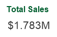
Now I can use the variable vScaleNumber in a Text Object as:

=$(vScaleNumber(Sum(Sales)))

The string “Sum(Sales)” will get substituted in  every occurrence of “$1”.  I ‘ll get an appropriately formatted number like:

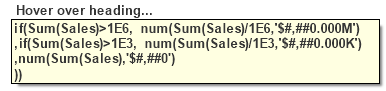
If I use “$(vScaleNumber(Sum(Sales)))” in a Straight Table expression without label, hovering over the column heading will show me the full substitution in  a tooltip.

I  can see that the “$1” substitution occurs before the expression is evaluated, and the substituted expression looks like:

if(Sum(Sales)>1E6, num(Sum(Sales)/1E6,'$#,##0.000M')
 ,if(Sum(Sales)>1E3, num(Sum(Sales)/1E3,'$#,##0.000K')
 ,num(Sum(Sales),'$#,##0')
 ))

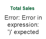
I’ve avoided re-typing “Sum(Sales)”. But I may have a concern about the performance implications of repeated execution of “Sum(Sales)”.  And what about more complex expressions such as “Round(Sum(Sales),10)”?  The comma in that expression will break the syntax as variable parameters always treat commas as parameter separators.

I can fix the comma/performance problem by using Dollar Sign Expansion (DSE) with an “=”.  The “=” will cause the expression to evaluate and pass the numerical result to vScaleNumber.

=$(vScaleNumber($(=round(Sum(Sales),10))))

Checking the expansion in a Straight Table shows:

if(1783150>1E6, num(1783150/1E6,'$#,##0.000M')
,if(1783150>1E3, num(1783150/1E3,'$#,##0.000K')
,num(1783150,'$#,##0')
))

I  see the value of “round(Sum(Sales),10)” has been calculated as “1783150”,  yielding an efficient and syntactically correct expression.

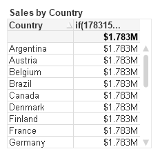
Next  I’ll add a Dimension to the Straight Table.  The row results are incorrect!

The “=” in the DSE caused the Sum expression  to be evaluated only once for the entire chart, yielding the same value for every row.  How to fix?

I will calculate the sum() expression in a n Expression n column, and then hide this column on the Presentation tab. I can then refer to the hidden column:

=$(vScaleNumber(Column(1)))

Once again, the expansion yields an efficient and syntactically correct expression.

if(Column(1)>1E6, num(Column(1)/1E6,'$#,##0.000M')
 ,if(Column(1)>1E3, num(Column(1)/1E3,'$#,##0.000K')
 ,num(Column(1),'$#,##0')
 ))

I started this post by demonstrating a simple expression to format scaled numbers. It’s a function I frequently use.

For more on DSE, see Henric’s post at https://community.qlik.com/blogs/qlikviewdesignblog/2013/11/18/dollar-expansions

A QVW example to accompany this post is available for download at http://qlikviewcookbook.com/wp-content/uploads/2016/05/ScalingNumbers.qvw.

-Rob

FacebookTwitterGoogle+Share

QV12 Timestamp Parsing

$
0
0

Have you noticed something new in QlikView12 and Qlik Sense timestamp parsing? UTC timestamps are automatically understood.

(Note: the output displayed below utilizes the US Date format set in the script as:  SET TimestampFormat=’M/D/YYYY h:mm:ss[.fff] TT’;)

For example, the expression:

=Timestamp('20160504T142523.487-0500')

returns:

5/4/2016 7:25:23 PM

That is, the UTC offset of “-0500” is detected and the returned value is the UTC time, not the local time of 2:25:23 PM.

I can’t find anything in the help beyond an example  for Timestamp# that demonstrates this but provides no detail.

This parsing functionality is particularly useful now that the QlikView Server logfiles use the UTC format for times.

I’m not sure yet if I like the automatic conversion to UTC time.  For example, apps like the QlikView Governance Dashboard now report Session Start or Event times in UTC time, not local time.

It’s nice that the “T” character is understood. If you want local time, it’s easy enough to drop the offset (“-0500”) as

=Timestamp(left('20160504T142523.487-0500', 19))

which returns

5/4/2016 2:25:23 PM

-Rob


FacebookTwitterGoogle+Share


Alt States Merged Selections Tip

$
0
0

Summary: I suggest a simpler syntax for merging selections from multiple states. 

You may be familiar with the “Product Grouping” example from the “What’s new in QlikView 11.qvw” sample.  It’s a great  beginner demo of using Alternate States for comparative analysis.

In this visualization, a user can select two sets of values from the [Product Sub Group] field. The two different sets are represented by two states, [Group 1] and [Group 2].  The blue [Group 1] bar is plotted on the bar chart using this expression:

sum({[Group 1]<Region = $::Region, [Sales Rep] = $::[Sales Rep], Path = $::Path, Year = $::Year, Quarter = $::Quarter, Month = $::Month>} Sales)

[Group 1]  as the Set Identifier indicates we want to start with the selections in [Group 1]. We then modify, or add, selections from the default state by referencing each field with the “$::fieldname” syntax.

The green [Group 2] bar is created with a similar expression, the only difference being [Group 2] as the Set Identifier.

The “$::fieldname” syntax works, but it forces us to list every field. Listing every field can get difficult. Is there an easier, more generic method?  Yes, if we redefine the problem as:  All selections from the Default state except for [Product Sub Group].

sum({[Group 1] * $<[Product Sub Group]=>} Sales)

Breaking the Set Expression down:

[Group 1]    // Group 1 selections
*    // Intersected with
$<[Product Sub Group]=>   // All selections from Default except [Product Sub Group]

I’m not suggesting  the sample is wrong. The “$::” syntax is useful to know and is required when you want to reference only specific fields.  I’m posting this alternative because I see people copying this more complex $::  syntax when the simpler syntax would suit their application.

-Rob

Join me at an upcoming Masters Summit for Qlik event in Johannesburg (6-8 Sept) or Austin (10-12 Oct).  Oleg Troyansky’s Set Analysis and Advanced Aggregation session provides  more useful tips and advanced techniques in using Alternate States.


FacebookTwitterGoogle+Share

Vizlib: Innovation and Agility

$
0
0

Summary:  As a provider of Qlik Sense visualization extensions Vizlib promises to blend the innovation and agility of open source with the reliability of commercial software.. 

The pace of delivery for visualization in Qlik Sense has been disappointing to some.  Thanks to rich open APIs in QS, much of the slack has been taken up by the community in the form of open source visualizations as seen on branch.qlik.com.   There you can see some remarkable innovation and responsiveness to community requests.

Should you use open source visualizations?  An open source extension may provide just what you need in your project.  But you should consider the unsupported nature of open source and evaluate the risk and consequences of the visualization possibly failing at some point.

When I worked as  a Java developer  my team used the open source Eclipse IDE as our main tool.  We also used a dozen or more open source plugins.  As our plugin library grew, we found that testing and updating plugins between releases was taking an inordinate amount of time, sometimes making us afraid to upgrade the base Eclipse product.   We  turned to a vendor and purchased a bundled version of Eclipse with dozens of plugins tested, supported and verified. Problem solved.

Vizlib is a new company is promising to blend the innovation and agility of open source with the commercial support that many customers demand.  Vizlib is partnering with the best extension authors to produce a library of fully supported high function visualization extensions. Check out some of what they have published so far:

  • A Table object that delivers the functionality of  a QlikView table and much more.
    • Rich Formatting Options just like in Excel/QlikView
    • Conditional show & hide of columns
    • Dynamic Labels
    • Minicharts & Progress Bars

  • An Advanced Text Object that provides the full functionality of the classic QlikView text object  (including actions!) plus additional functionalities like HTML code and icons. 

To date Vizlib has released five visualizations with more on the way. Check out what’s available on the Vizlib download page.  A free trial license is offered that allows you to try any of the extensions in your own installation.  Take a look!

-Rob

Share

Web Dev for Qlik Devs Course in San Francisco

$
0
0

In January I attended (review) Nick Webster’s  “Web Development for Qlik Developers” course.  I found the course extremely valuable so I’m bringing Nick  to San Francisco September 19-22 for a four day fast track course.

Are you a Qlik Sense Developer that wants to understand how to use the various QS APIs to create your own mashups,  portal integrations or custom content pages that leverage data from Qlik Sense?  Do you want to create your own QS Visualization Extensions or modify existing extensions?

In this four day hands on course you’ll learn:

  • The fundamentals of HTML/Javascript/CSS as they apply to QS Development and how to get started with some  popular frameworks and libraries.
  • Creating Visualization Extensions.
  • The differences and application of the various QS APIs e.g. Capability, Visualization, Engine.
  • Important QS core concepts such as the generic object model.
  • Connecting to the QIX engine to retrieve existing content or generate associative aggregations (hypercubes) on the fly.
  • Visualizing data using third party libraries.

You’ll come away with example code and your own completed exercises giving you the confidence to move ahead on your own.

No prior experience with web programming is required as the course will provide an intro to those technologies and how they are used in Qlik Sense Web Development.

Course fee, location and registration here.   Don’t wait, as the class is limited to 10 students!

-Rob


Share

QV12 Variables with Alt State Fixed

$
0
0

Summary:  QV11 contained an inconsistency in how variables with equal signs were evaluated when using Alternate States.  This has been fixed in QV12.10.  Read on if you want the details. 

QlikView V12.10 includes an important fix to variable evaluation when using alternate states. A quote from the Release Notes:

In QV11.20 the variable was expanded in the first state encountered and this resulted in a random behavior when more than one alternate state was being used. Whereas in version 12 and up, the variable always belongs to a specific alternate state and this results in different behavior.

The random behavior described in QV11.20 has generated several interesting posts to QlikCommunity with responses of “I can reproduce” / “I can’t reproduce” and few clear answers.

I find the problem confusing and interesting enough to warrant an explanation and example beyond the Release Note.

What I am describing in this post only affects variables with a leading “=” in the definition, e.g. “=Sum(Sales)”.  These variables are calculated once in the context of the entire document. They are not calculated per row in a chart.

Let’s consider a variable named “vSumX” with a definition of “=Sum(X)”.  The expression simply sums all selected values of X.   Suppose we have two States in our document — “Default” and “State1”.  There could be two different selections for “X”.  Which set of X should the variable sum?

If we consider the variable definition in isolation, the answer is “Default set”  as there is no set identifier in the expression.  But what if the variable is referenced in an object in State1.  Should the State1 values of X be used?

No matter what you think the rules should be, here’s what was happening in QV11.20.  The variable was expanded (evaluated) in the first state encountered.  First state encountered means first state in the calculation chain, not something the developer directly controls.

Let’s look at some examples.   I’ve created a sample app (you can download here) with three States — Default,  State1 and State2.  The variable “vSumX” is defined as “=Sum(X)”.

With all objects on sheet in the Default state, selections in X would yield results like this.  (Note “$” indicates default state).

The first text box contains the expression “Sum(X)”.  The second text object contains the reference to variable vSumX.  The two values are what we might expect, summing the selected values of X in this state.

Let’s switch to a sheet that contains objects in the state named “State1”.

No selections in X and the first text object shows the expected result.  The second object shows the value of vSumX as previously calculated from the default state.  If we make selections on this State1 sheet, that will cause vSumX to be recalculated and both State1 and the Default sheet will reflect the State 1 number.  Is that correct?  Is it useful?  It’s at least consistent and comprehensible.

My next example is where the aforementioned “random” comes into play.  Let’s put objects from three states on the same sheet.

I’ve selected some values in the Default state of X and the results are what I might expect.  The value of vSumX is calculated from my last selections and the variable value is consistent across objects — there is only ever one value for a variable at a given point in time.

Now I select some X values in State1 and expect to see a new value (19) for vSumX.  But no change! The variable was expanded (evaluated) in the first state encountered which happened to be Default ($).

Now I select some X values in State2.  If the vSumX calc used my last selection I would expect to see 7.  But no, I see 19.  The State1 values were used.  If I repeat the exercise, it may use a different state to calc vSumX.  If you test you may get different results.  In this last example, State1 was used because it was the first state encountered in the calculation chain.  The order is not consistent.  It will be influenced by factors such as number of available processors and the order in which the objects were created.

Now that we’ve established that QV11,20 is broken in this regard, how was it fixed in QV12.10?  Simple.  QV12 uses  set identifiers as specified in the expression, without inheritance.

=Sum(X)

will use the Default State as there is no identifier.   If you want to Sum from a specific state, use it in the expression:

=Sum({State1} X)

Variables do not belong to any State.  Aggregation functions used in a variable may specify a Statename, just as chart expression do.  The difference is that the absence of a set identifier in a chart expression means “inherit the state from the containing object”.  In a “=” variable, no set identifier means “use the default state”.

A reminder that end of standard support for QV11 comes on Dec 8, 2017.  If you haven’t yet upgraded to QV12.10, I encourage you to do so.  Download my  QV12 Upgrade Considerations Doc as part of your planning process.  Feel free to contact me if you want some assistance with your upgrade.

-Rob

Share

Quick Sense App in a Page

$
0
0

Summary: Learn an easy method to deliver a Qlik Sense app as an embedded web page. Yes, the spelling of this post’s title is intentional 😉

I just came off a week of Qlik Sense API & Integration training with Nick Webster of Websy.  I’ve been nothing short of impressed with the integration and reuse options of Qlik Sense.

I was intrigued today by a question on Qlik Community asking if there was a way to disallow the application Edit mode in Qlik Sense Desktop.  The poster wanted his students to just “use” an app and not poke around in the design until a later time.  Kind of like the “distraction free” mode  in text editors.

The challenge I gave myself was how quickly could I knock out a solution to this problem?  I’ll detail my solution below and I’ll tell you it is taking me longer to write this blog post than it took to build the solution.

Rather than working at disabling or removing function I didn’t want, I approached the problem as including only what I wanted. My first thought was to create a mashup that represented the entire application.  Then I struck on an even easier approach — use the Qlik Sense “Single Integration API” with a bit of Bootstrap.   The Single Integration API does not require writing any code.  It’s just a URL that displays a single Visualization or complete Sheet.  You can create URLs and experiment with options in the Dev Hub Single Configuration Tool.

Bootstrap is a popular web design toolkit that makes it easier to create responsive and interactive web pages.  Thanks to Nick’s class I understood how Qlik utilizes bootstrap.

A basic URL to display a sheet looks like this:

http://server/single/?appid=myappid&sheet=sheetId&opt=options

Appid is a qvf filename on QS Desktop, or the GUID if using QS Server.  Options allow you to control  things like allowing selections.  A complete list is in the API doc.

With 50 lines of html I created a web page that delivers the full associative experience across seven sheets, including Current selections, Smart search and the Selections tool.

Here’s a screenshot showing my sheet navigation buttons across the top and the Sheet content, including Current selections, immediately below the buttons.

The html file is available for download here.  I used the “Sales Discovery” sample app but it is easy to adapt the file to any application.

There is a single iframe nested in a responsive Bootstrap container.  The buttons simply change the src attibute of the iframe to load a specific sheet .

If you want to try the file yourself you  only need to change the “var appid=” string to point to the app path on your machine.  No web server is required, just double click the html file to launch.  Your server or QS Desktop must be active.  Yes, this file works as is with QS Server.

Nick and I will be showcasing a variety of QS integrations at the Masters Summit for Qlik in Boston Oct 23-25.   Nick will also be presenting  a half day “Qlik Sense Integration” session at the summit that will teach you how to create a basic web page with bootstrap and explore more advanced QS integration options.

-Rob


Share

Viewing all 28 articles
Browse latest View live